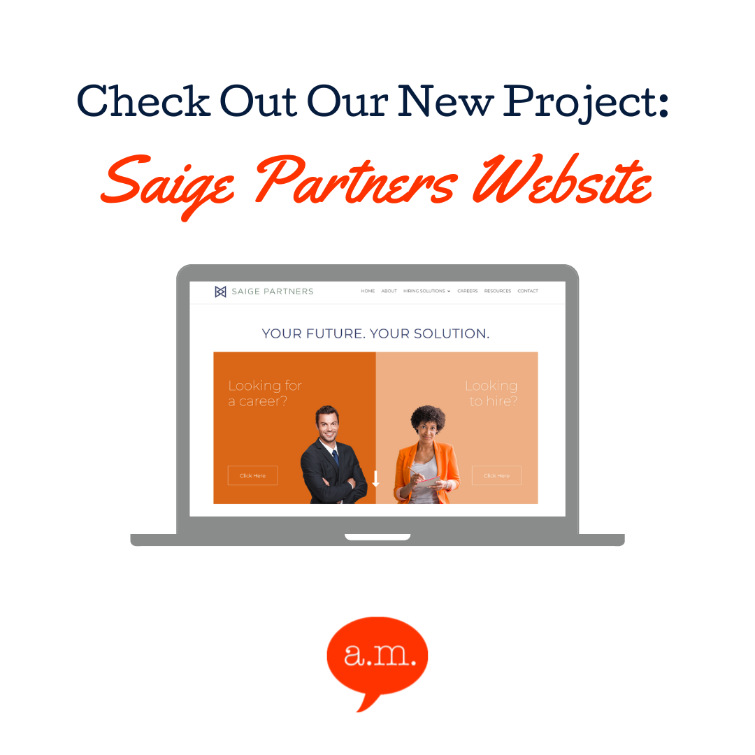
In the fast-paced world of the internet, the role of a website is pivotal for any business striving to make a mark. In 2023, Abask Marketing embarked on an exciting project, taking the opportunity to revamp Saige Partners website. The goal was to make their website more user-friendly and keep it aligned with the brand’s vision. With meticulous attention to detail, the team delivered a website that retained simplicity while revolutionizing the user experience.
Client’s Vision: A Simple yet Effective Design
When Saige Partners approached us, they had a clear vision for their website. Their existing website had a simple and clean design. They wanted to keep this brand identity and avoid any drastic changes in appearance that could confuse loyal customers. They knew their brand and audience well and were keen on maintaining familiarity.
Marrying Design and User Experience
The challenge was clear: How could we enhance the user experience while keeping the design intact? Our team at Abask tackled this head-on, and the results were nothing short of phenomenal.
Our design team meticulously analyzed the existing design and identified elements that could be streamlined and modernized without losing the brand’s essence. The most significant change was in user experience.
User-Centered Approach
We conducted extensive research on user behavior to make the Saige Partners website more user-friendly. We found and chose to renovate specific pain points that users experienced on the website. This user-centered approach led to a series of significant changes that improved the overall experience:
- Streamlined Navigation: We restructured the website’s navigation, making it more intuitive and reducing the number of clicks needed to access critical information. This was a game-changer for users, as they could quickly and easily find what they were looking for.
- Mobile Optimization: With the increasing use of mobile devices, we ensured the website was fully responsive. This made it accessible and enjoyable for users across various platforms, thus expanding the client’s reach.
- Faster Loading Times: We optimized the website’s performance, significantly reducing page load times. Users no longer had to wait, enhancing their overall experience and reducing bounce rates.
- Clear Call-to-Actions: We strategically placed clear and engaging call-to-action buttons throughout the website. This guides users to take desired actions like contacting customer support or looking for a specific job listing.
Search Engine Optimization
In addition to the significant improvements in design and user experience, Abask Marketing took the extra step to ensure the client’s website was optimized for search engines. This involved addressing a unique request from the client to list every job title they hire for on the home page of the website.
Incorporating an extensive job title list directly on the home page provided a valuable resource for job seekers and search engines. This strategy made the website user-friendly and boosted its SEO ranking. Saige Patener’s website now has improved search engine visibility for their target audience, those looking for a job.
On-Time Delivery and No Budget Changes
One of the proudest achievements of this project was our ability to deliver the enhanced website on time and within the agreed budget. Our project management team worked diligently to ensure every milestone was met without delays. This commitment to deadlines and budget integrity earned the client’s trust and showcased our efficiency as a marketing company.
This success story is a testament to our ability to adapt to our client’s specific needs and aspirations while keeping up with the latest trends in web design and user experience. As we move forward, Abask Marketing remains a reliable partner for businesses looking to enhance their online presence and make a lasting impression in the digital world.
Visit https://abaskmarketing.com/contact-us/ to get in contact with us about your website redesign.


0 Comments