Landing pages are the unsung heroes of the digital marketing world. They’re where the magic happens—where curious visitors transform into paying customers, subscribers, or leads. But here’s the kicker: not all of these pages are created equal. Some look great but lack the secret sauce to drive action, while others seem minimal yet rake in results like a well-oiled conversion machine.
At Abask Marketing, we’ve seen it all—from sleek pages that flop and simple designs that soar.
The difference? It’s not just about getting clicks. It’s about designing for conversions. So, let’s break it down. What makes a landing page irresistible, and how can you make yours a conversion powerhouse?
First Impressions Matter (A Lot)
The moment someone lands on your page, they’re forming an opinion—faster than you can say “welcome.” In fact, research shows you have about 50 milliseconds to grab their attention. That’s less time than it takes to blink. That means your headline, visuals, and overall vibe must hit home instantly.
The trick here is to focus on clarity. Your visitors shouldn’t have to play detective to figure out what you’re offering or why it matters. A bold, benefit-driven headline works wonders to achieve this. Combine that with an eye-catching hero image or video that tells your story at a glance. Think of it as your digital elevator pitch with a visual assist.
The Power of a Singular Focus
One of the biggest mistakes we see is cramming too much into one page. Your landing page is not a buffet. It’s a gourmet dish with an irresistible flavor (your call to action). Whether you’re aiming for sign-ups, downloads, or purchases, everything on the page should push your visitor toward that one goal.
Strip away distractions. Ditch the unnecessary navigation bars and cluttered layouts. Each section of your page should build momentum toward your CTA. A clear path equals less hesitation, and less hesitation equals more conversions.
Copy That Connects
Too often, website copy falls into two traps: it’s either overly vague (“We’re the best!”) or excessively detailed (“Here’s a 20-step breakdown of our process”). The sweet spot lies somewhere in between.
Great website copy speaks directly to the reader’s needs and desires. It’s about them, not you. Instead of listing features, highlight benefits. How will your product or service make their life better, easier, or more exciting? Use active, compelling language that sparks curiosity and builds trust.
Oh, and one more thing: make it scannable. Break up your text with subheadings, short paragraphs, bullet points, and plenty of white space. The easier it is to read, the more likely it is to resonate.
Design for Trust and Ease
Even the best copy in the world won’t save a landing page that feels sketchy or hard to navigate. Design plays a crucial role in building trust. Use clean, modern aesthetics, and avoid anything that screams “1998 pop-up ad.”
Include trust signals like testimonials, case studies, or recognizable logos of clients you’ve worked with. If you’ve won awards or earned certifications, flaunt them. The goal is to show visitors that you’re the real deal.
Get your guide on how to get reviews here!
Also, prioritize mobile responsiveness. With most internet traffic coming from mobile phones, a landing page that doesn’t play nice on mobile is a conversion killer. Make sure your page looks great and functions smoothly on every device.
The Science of the Perfect CTA
Your call to action is the crown jewel of your landing page. It’s the moment of truth—the digital equivalent of popping the question. To make it irresistible, you’ll need to nail three things: clarity, contrast, and urgency.
Clarity means your CTA should leave zero room for confusion. “Sign Up for Free” or “Get My Guide” works much better than vague phrases like “Submit” or “Click Here.”
Contrast ensures your CTA stands out visually. Use a bold color that contrasts with the rest of your design, and place it in a prominent, easy-to-find spot.
Urgency is about creating a sense of now-or-never. Phrases like “Limited Time Offer” or “Download Today” tap into the psychology of FOMO and spur action.
Test, Analyze, and Optimize
Here’s the not-so-secret truth: no page is perfect right out of the gate. Even the pros tweak and refine to get the best results. The key is to track performance metrics like conversion rates, bounce rates, and time on page.
Try A/B testing different elements like headlines, CTA wording, colors, or images to see what resonates most with your audience. Small changes (like tweaking a headline or swapping an image) can sometimes lead to big wins.
And remember, what works today might not work tomorrow. Regularly revisiting and updating your website keeps them fresh and aligned with your goals.
Ready to Take Your Landing Pages to the Next Level?
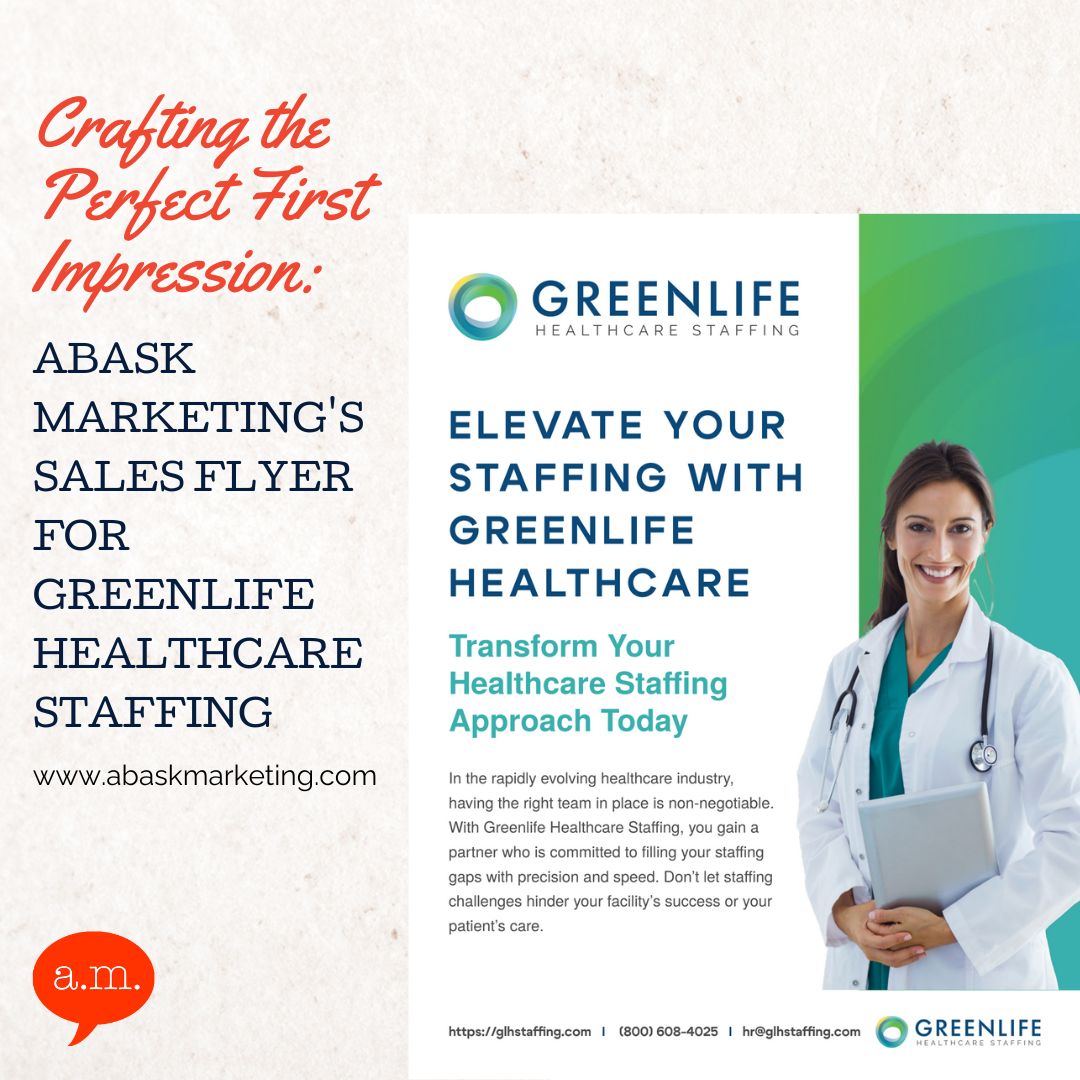
If this all sounds exciting but a little overwhelming, don’t worry—you don’t have to tackle it alone. At Abask Marketing, we specialize in crafting websites that don’t just look great but deliver real results. Whether you’re starting from scratch or looking to boost the performance of existing pages, we’ve got your back.
Schedule a free consultation today, and let’s chat about how we can turn your clicks into conversions. Because at the end of the day, it’s not just about getting traffic—it’s about what happens next.
Landing pages aren’t just a science—they’re an art. And when you get them right, the payoff is pure marketing gold.


0 Comments